Metric SDK
A Block developer may want to publish certain metrics associated with the blocks. These metrics can either be simply stored to use in some computations or can be displayed using charts on the platform. Metrics can be divided into below categories:
Hardware Metrics: Hardware Metrics contains information regarding Memory and CPU usage of a block.
Queue Metrics: Queue Metrics provides information regarding amount of data produced to or consumed from a queue for each block in terms of number of records read/written over time.
Data Metrics: Data Metrics is used to show block specific data as mentioned by the user. Data Metrics can be either time relative or not. The former shows the data v/s time graph whereas only the last updated data is shown in the latter.
The user need not provide metric data for Hardware and Queue metrics, as these are automatically captured by the platform and plotted while running a Pipeline. Data metrics can plotted using MetricUtil SDK created for the plotting various Metrics. The Plots can be Line Graph, Bar Graph, Confusion Matrix, Box Plot.
Use the below SDK methods to plot metrics:-
To use the SDK, add the below line of code:
from pipelineblocksdk.util import MetricUtil
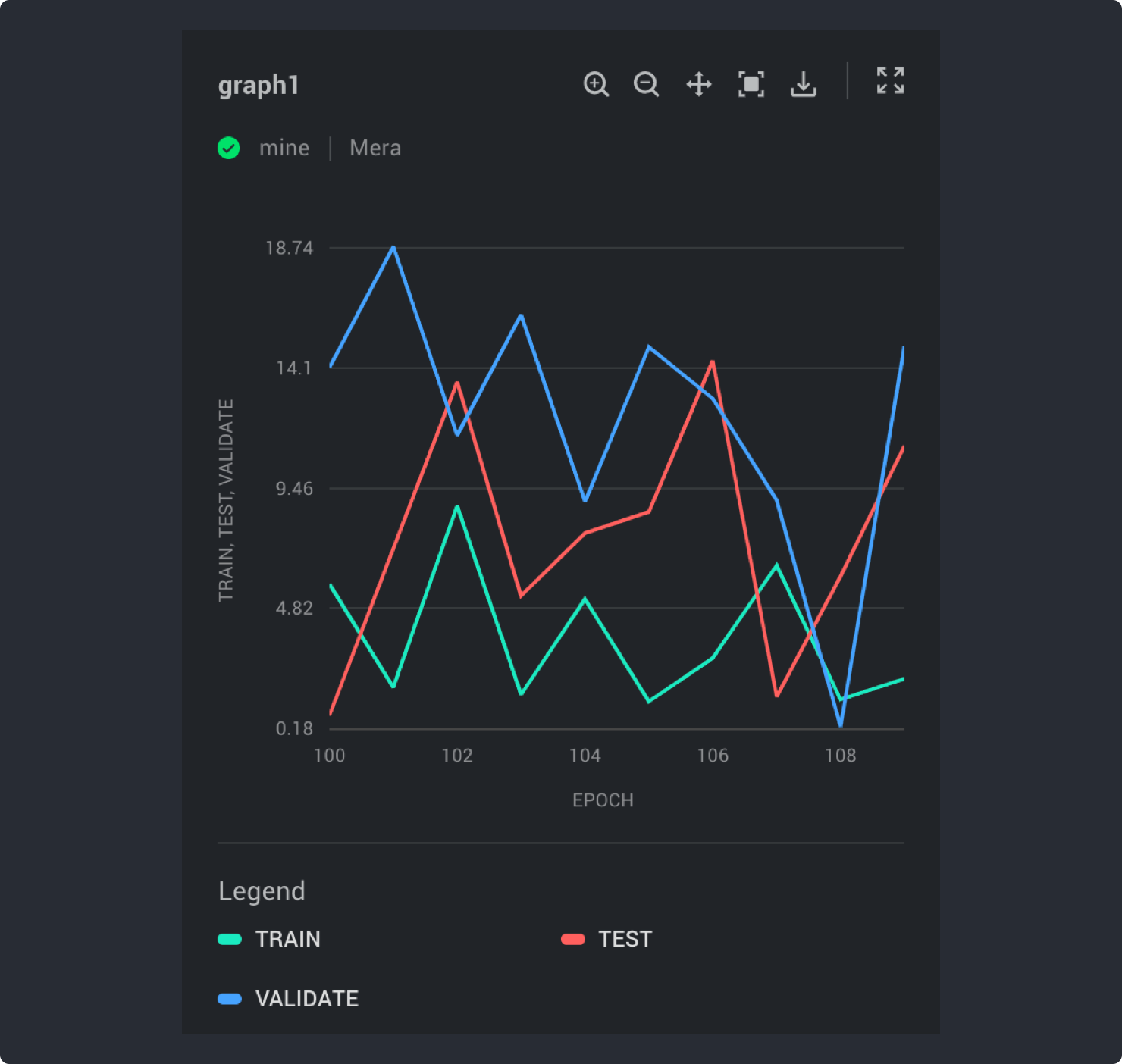
Line Graph
MetricUtil.plot_line_graph(metric_label, y_values=[], y_label=[], block_params={})
metric_label: title to be shown for the metric plotted
y_values: list of values on y axis corresponding to time in x axis
y_label: list of labels for each line in the line graph plotted
block_params: pass the block parameters to this parameter
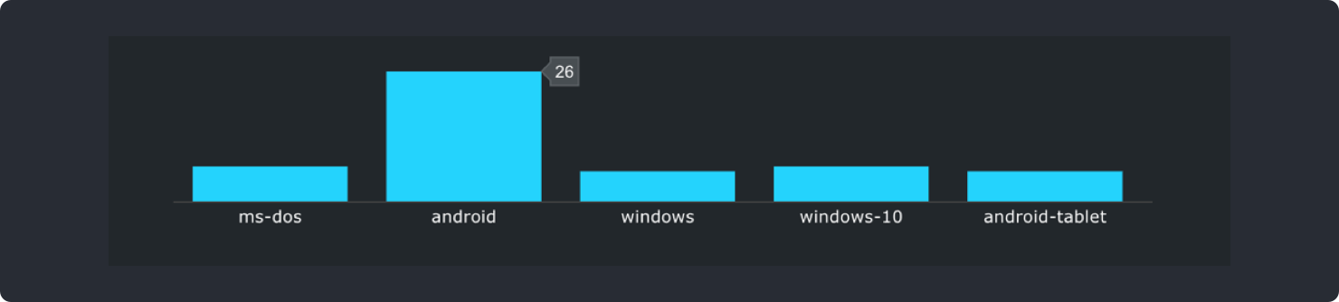
Bar Graph
MetricUtil.plot_bar_graph(x_title, y_title, y_label=[], block_params={}, metric_data={},
chart_type=’group’, color_code, metric_label)
x_title: title to be shown for x-axis
y_title: title to be shown for y-axis
y_label: list of names representing each bar in bar-graph
metric_data: dictionary contain column names for which bar graphs have to be plotted as keys and list of values for each bar as values
chart_type: can be ‘group’ or ‘stack’
color_code: list of hex-codes for the color representing each bar
metric_label: title for the metric plotted
block_params: pass the block parameters to this parameter
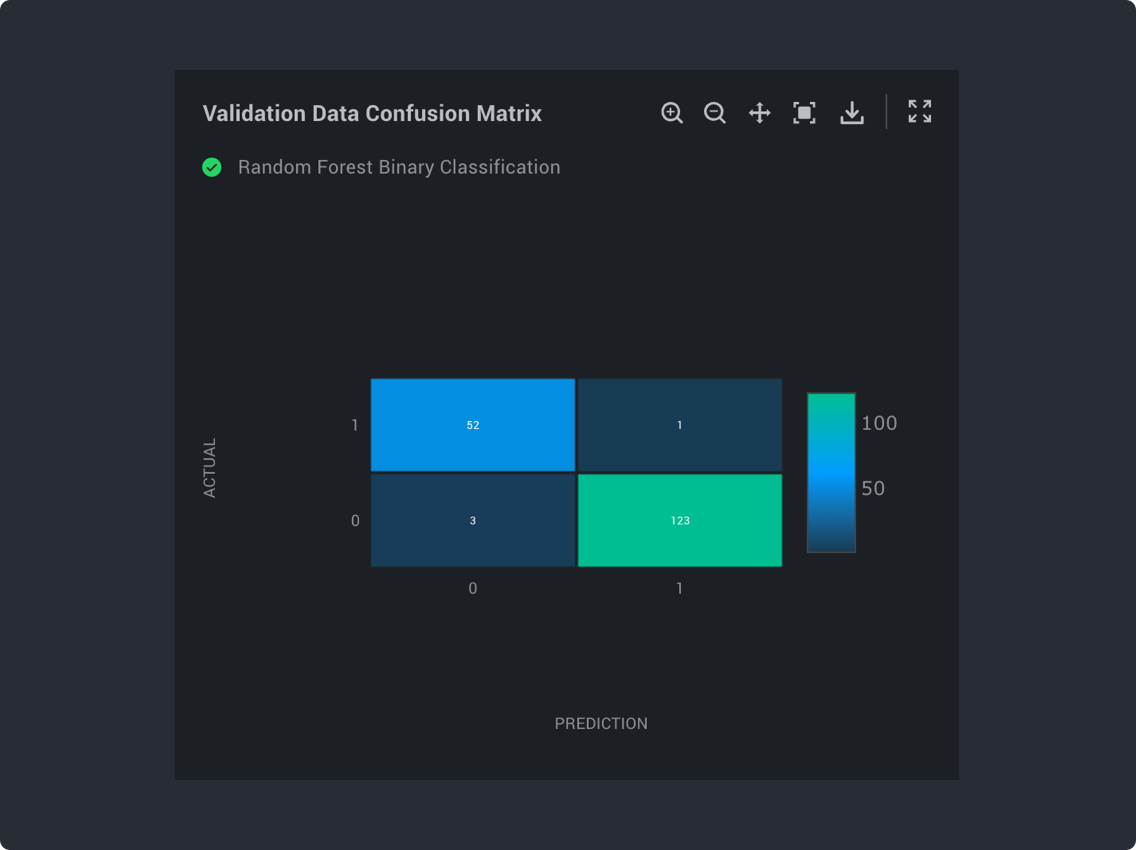
Confusion Matrix
MetricUtil.plot_confusion_matrix(tp, tn, fp, fn, x_label, y_label, step=1,
metric_label, block_params={})
tp: number of true positives
tn: number of true negatives
fp: number of false positives
fn: number of false negatives
x_label: title for x axis
y_label: title for y axis
step: value that shows how many iterations were used
metric_label: title for the metric plotted
block_params: pass the block parameters to this parameter
Box Plot
MetricUtil.plot_box_plot(metric_data,  column=None, x_title="Xaxis", y_title="Yaxis",
metric_label="metric label", block_params={})
metric_data: should be dictionary containing all necessary data required to get a box-plot. The keys used in dictionary are as follows: eg.,
  metric_data = {
	 "first_quartile": 56.67,
	 "median": 117.11,
	 "third_quartile": 364.69,
	 "IQR": 308.02,
	 "outlier_lower_limit": -405.35996,
	 "outlier_upper_limit": 826.72,
	 "min": 6.92,
	 "max": 524.96,
	 "mean": 154.12
}
or alternatively one can use the output of Quartile Block as metric data
column: this is the column name for which the box_plot is for
x_title: the title for the x-axis
y_title: the title for the y-axis
metric_label: title for the metric plotted
block_params: pass the block parameters to this parameter

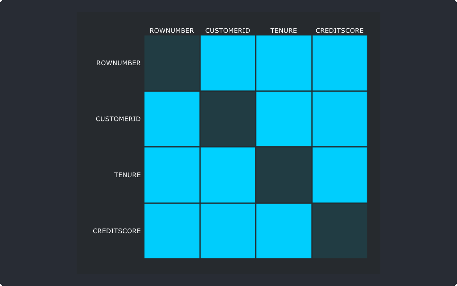
Correlation Matrix
MetricUtil.plot_correlation_matrix(metric_data, metric_label=”Correlation Matrix”,
block_params={})
metric_data: should be dictionary containing column_names as keys and column_values as values. Eg.,
  metric_data = {
       “column1”: [1.0,0.00420,-0.00649,0.005840],
       “column2”: [0.004202,1.0,-0.01488,0.005309],
       “column3”: [1.0,0.00420,-0.00649,0.005840]
}
metric_label: title for the metric plotted
block_params: pass the block parameters to this parameter
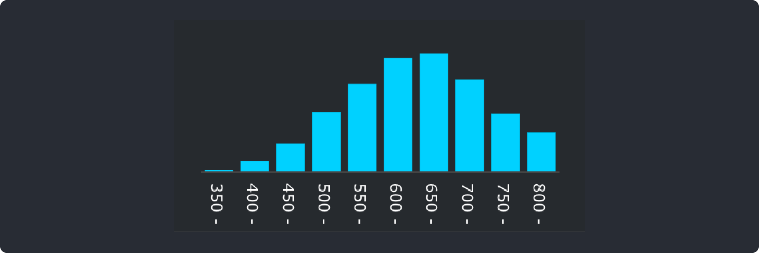
Histogram
MetricUtil.plot_histogram(column_name, x, y, x_title, y_title,
metric_label='Histogram', block_params={})
column_name: column name for which the histogram has to be plotted
x: list of strings containing values for x-axis
y: list of strings containing values for y-axis
x_title: the title for the x-axis
y_title: the title for the y-axis
metric_label: title for the metric plotted
block_params: pass the block parameters to this parameter
Tabulate Data
MetricUtil.tabulate_data(rows, headers, column_name, metric_label, block_params={})
rows: list of lists containing each row for the table
headers: list containing header for each column in table
column_name: column for which for eg. you find the statistics and tabulate it
metric_label: title for the metric plotted
block_params: pass the block parameters to this parameter
Tabular Data
MetricUtil.plot_tabular_data(headers=[],records=[],  block_params={},
metric_label="tabular-data")
records (*): list of list containing each row of the table data
headers (*): ist of table column names
block_params (*): pass the block params
metric_label: metric label for the tabular graph (Default tabular-data)
Fields marked * are mandatory for plotting tablular graph
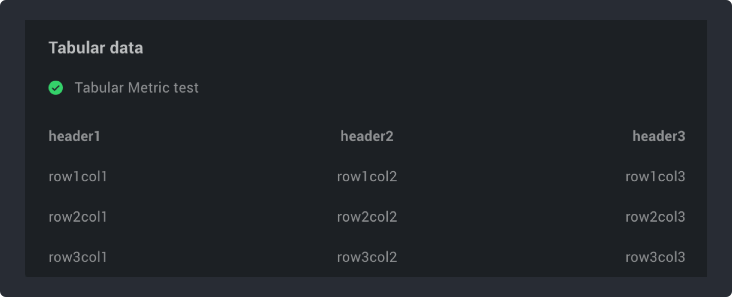
In above sample screenshot, Text Tabular data is the metric label and Tabular Metric test is the project name.